
Instagram Rebrands: A Bolder Wordmark, Three Typefaces and a Quieter Gradient
Instagram has introduced its first brand identity refresh in more than ten years. Announced on August 13, 2026, it brings a redrawn wordmark, three typefaces and a brand system that leans on the famous gradient far less than it used to. The wordmark is rolling out globally now; the rest of the system arrives through 2026 and beyond.
The wordmark: same script, different confidence
The design team says it explored hundreds of directions — all-caps treatments, camera concepts, literal handwriting — before returning to the script that has carried the brand since the start. The new drawing is bolder and geometrically simpler, with a few deliberately odd details that keep it from reading as a generic script font.
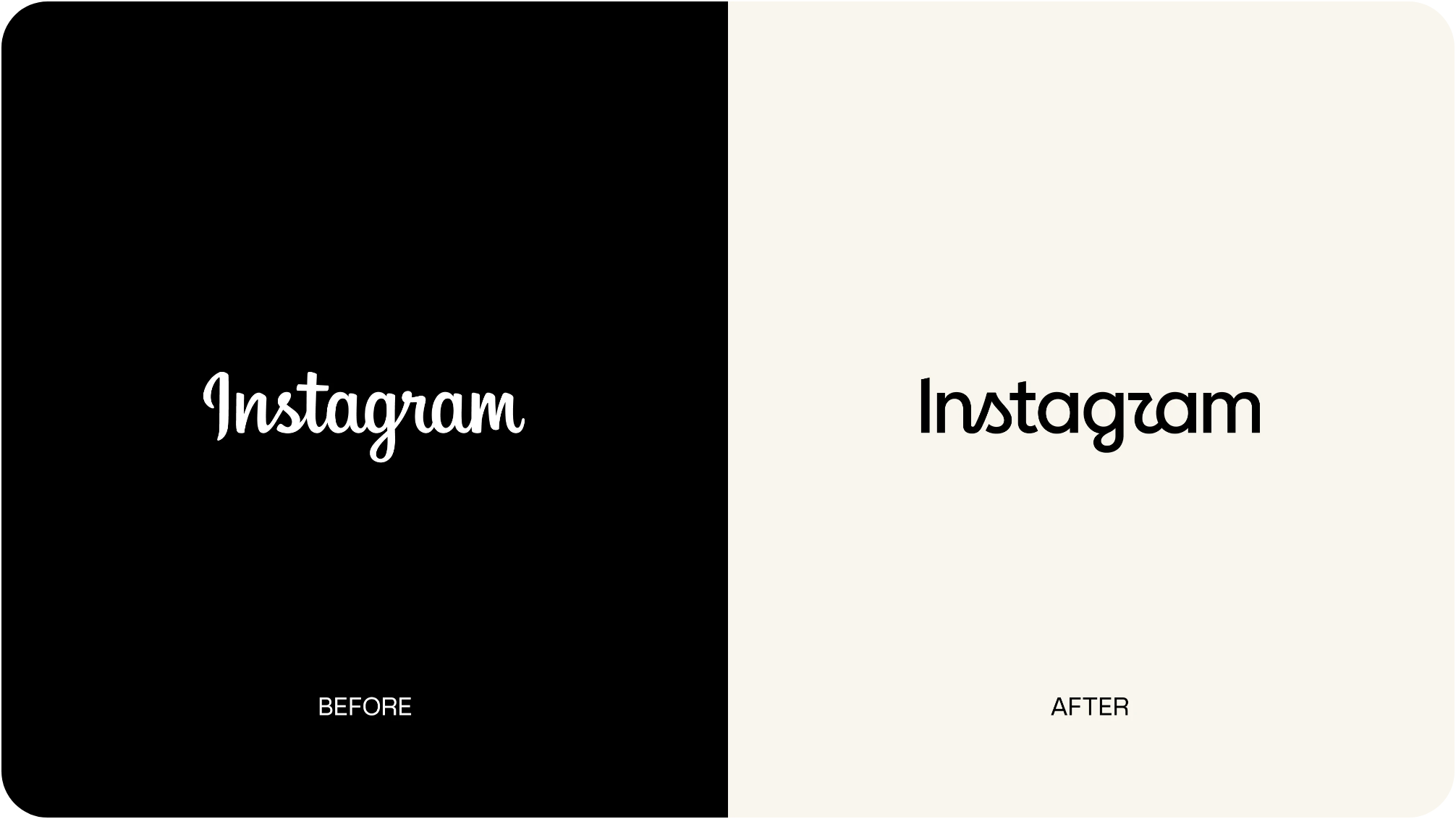
"Script reflects individuality, so referencing that felt right," said Jasmine Probst, Director of Product Design at Instagram, describing the new mark as bolder and simpler, "with touches of unexpectedness."
A system, not just a logo
The bigger change sits behind the wordmark. Typography now carries three faces: an updated Instagram Sans, a new handwriting typeface called Instagram Pen, and a new Instagram Mono. The gradient stays a core brand asset but is used more sparingly, alongside refreshed motion, layout and interface elements. The stated intent is to leave more room to breathe, so that community content — not brand furniture — carries the energy.
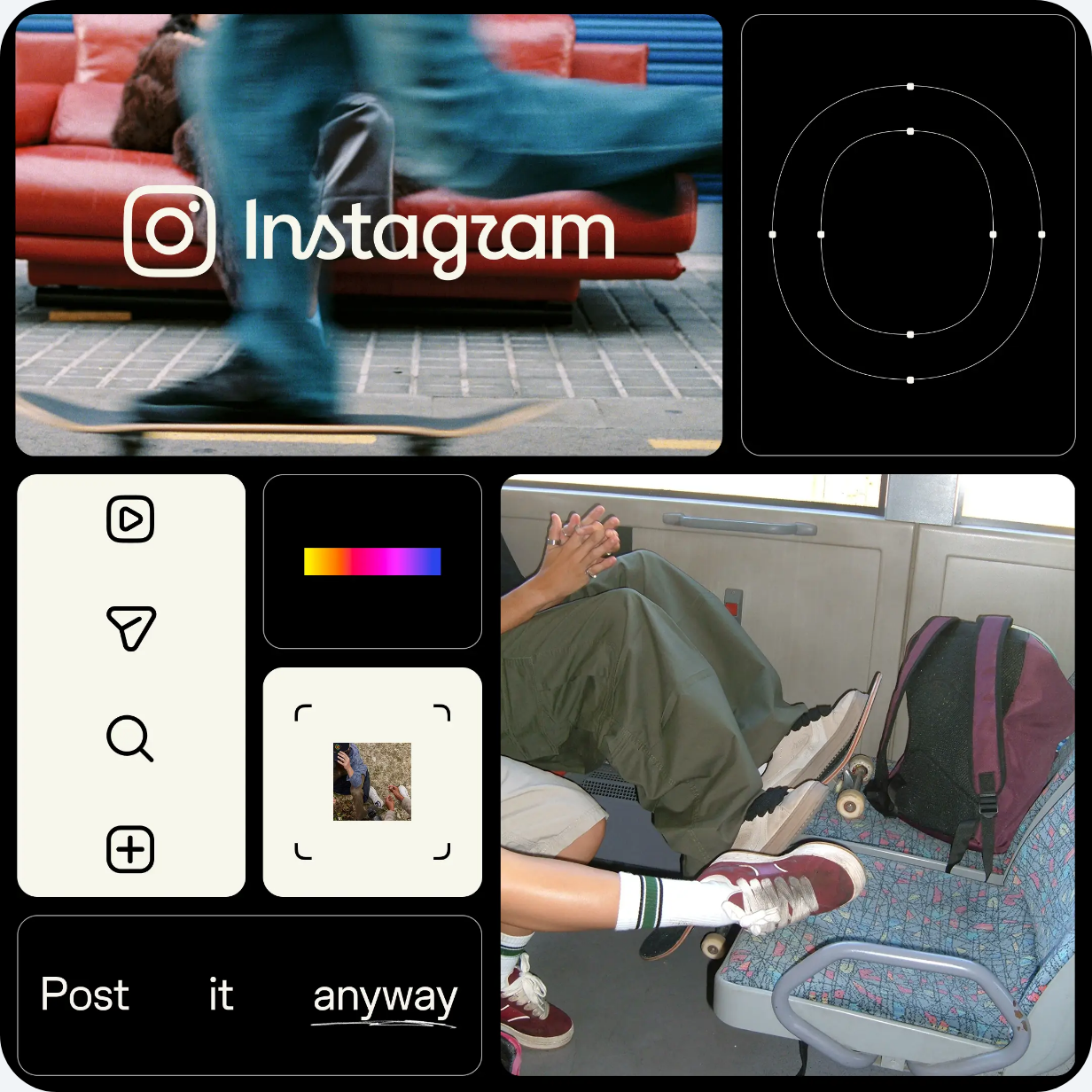
May Hartono, Director of Brand Design at Meta, framed the system as putting "our community's creativity and self-expression front and center."
What it means for brands and creators
Nothing about ad formats, targeting or measurement changes here — this is identity work, not product. The practical consequences are quieter, and mostly about asset hygiene.
Expect a long mixed period. A global rollout running through 2026 and beyond means old and new marks will coexist across app stores, press kits, partner pages and creator media kits for months. Anything that pairs your logo with Instagram's — co-branded creative, event signage, "follow us on" footers — will look dated before it looks wrong, so it is worth auditing where those lockups live rather than replacing everything at once.
Screenshot-based creative ages faster. Ads, case studies and sales decks built on captured interface screens will start to show a UI that no longer matches the app as the refreshed layout and motion land.
A quieter brand raises the bar on the content itself. If the platform's own surfaces get more restrained, gradient-heavy maximalist creative stops reading as native and starts reading as an ad. That is a brief worth revisiting — much like the argument for buying formats that keep working after launch day, which we covered in Statista's survey on what actually closes the sale.
For planning placements across Instagram, Telegram, YouTube and other platforms, compare active inventory in the channel catalog.
Source: "Built to celebrate creativity: the new Instagram brand identity", Design at Meta, August 13, 2026. Images: Design at Meta.
Was this article helpful?
You may also like

Time Is Selling Ads to AI Agents, Not to People
Trust, Not Reach: What Australia's 2026 News Report Says About Creators